get in touch

NotesPROPS!

The design system

The site looks like the inside of a design tool. Pages sit on off-white grid paper, the main heading on each page sits in a selection frame with square handles, and sticky notes and cursor tags can be picked up and dragged. Lime and forest green lead, and each category has its own accent colour, used wherever that category appears.

Client
PROPS!
Scope
Product Strategy, Design & Development
Part
2 of 4
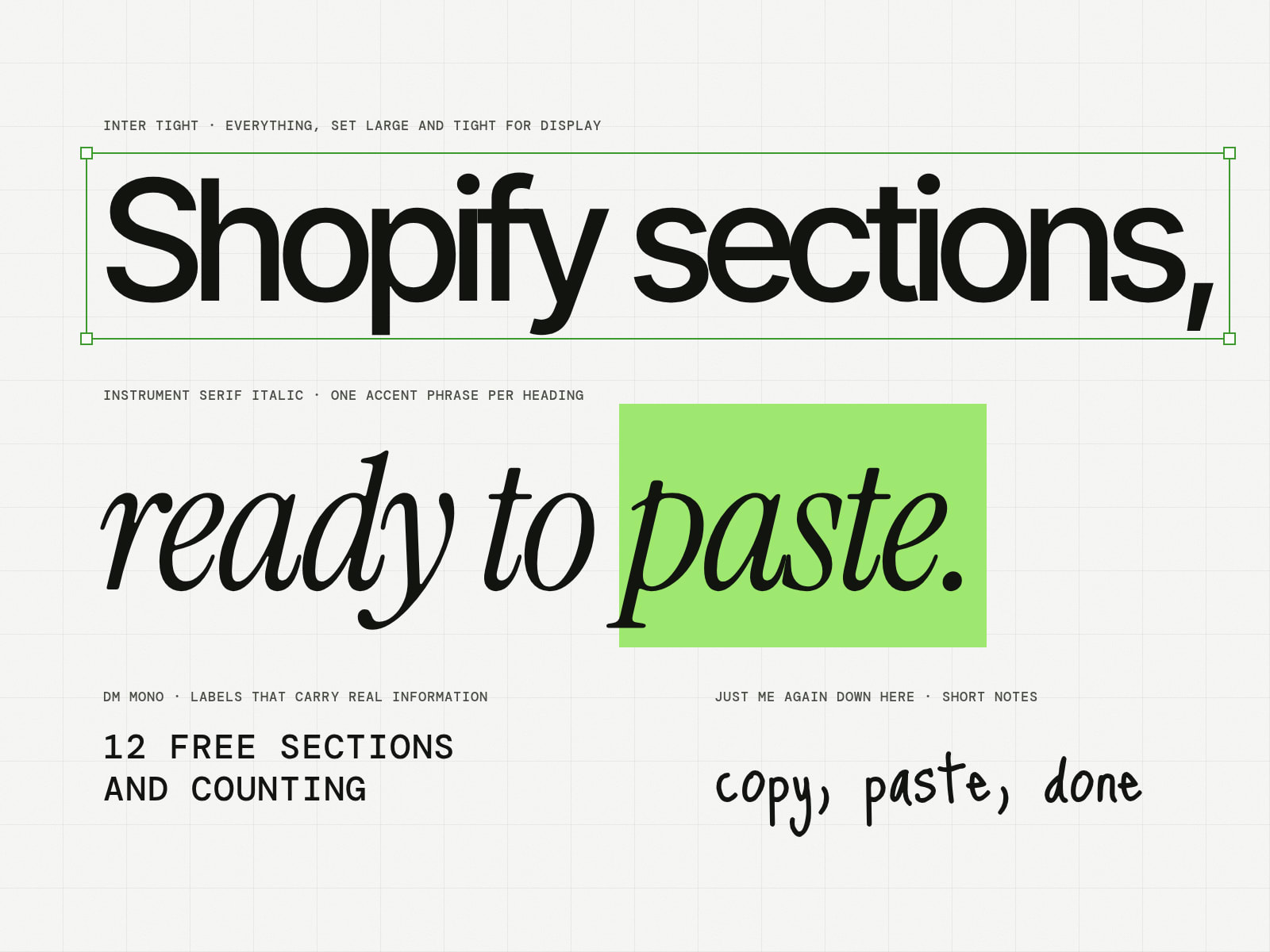
The four PROPS typefaces in their jobs: Inter Tight for Shopify sections, Instrument Serif italic for ready to paste, DM Mono for 12 free sections and counting, and a hand font for copy, paste, done

Inter Tight sets everything, large and tight for headings. Instrument Serif italic marks one phrase per heading, DM Mono is used only for labels that carry real information, such as a section's file name, and a handwritten font is used for short notes.

The six PROPS colours as sticky notes: lime and forest large, then lilac for Gallery, butter for Social Proof, coral for Content and sky for Interactive
The Gallery Grid section card at rest and on hover, when the whole card fills with lilac, its category colour
Small rounded parts on the square canvas: the search field, the category chips, the section actions and the Browse sections button